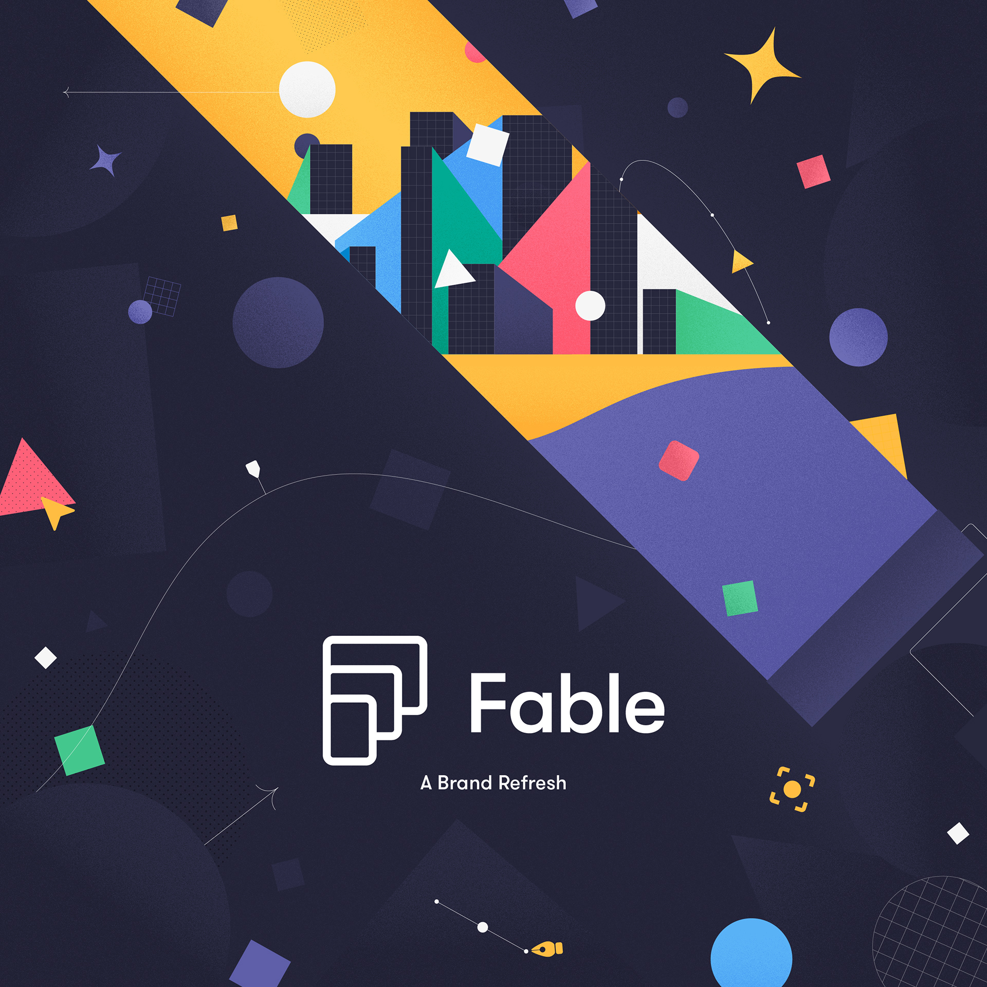
Fable is a motion design tool aimed at teams and bridging the gap between the complexities of After Effects and other online overly simplistic motion tools.
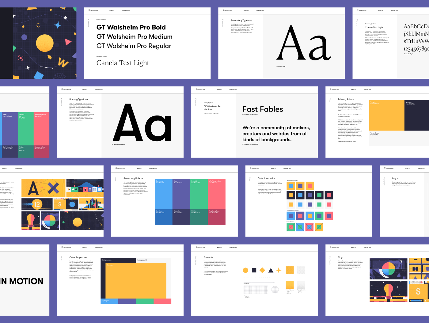
In early 2022, we started talking about revamping Fable's frontend. Initially, Fable's brand guide was comprised only of logo and typography guidelines, but not much in the way of establishing a cohesive visual identity. Content, illustrations, typography and colors were all a bit scattered, so it was time to reign things in.
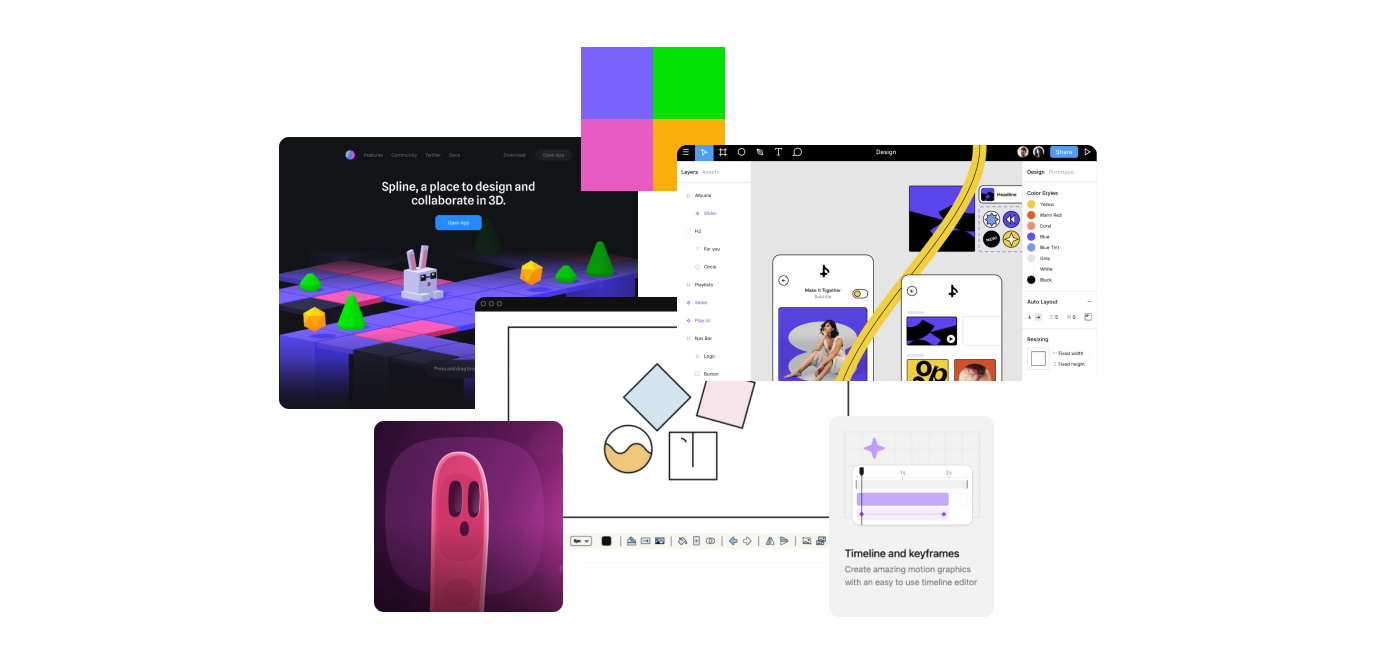
I first took it upon myself to research how our competitors and adjacent companies were positioning themselves.
I first took it upon myself to research how our competitors and adjacent companies were positioning themselves.
This was a great exercise in
1. identifying strengths and weaknesses in the companies’ identities,
2. isolating what would and wouldn’t work for our brand and
3. laying the foundation for Fable’s brand new coat of paint.
I then conducted an in depth audit of all of Fable’s content across multiple platforms: anything from our website’s illustrations to our Youtube’s thumbnails. I curated elements that could be retained while eliminating those that strayed too far from the direction we wanted to go into.
I then conducted an in depth audit of all of Fable’s content across multiple platforms: anything from our website’s illustrations to our Youtube’s thumbnails. I curated elements that could be retained while eliminating those that strayed too far from the direction we wanted to go into.
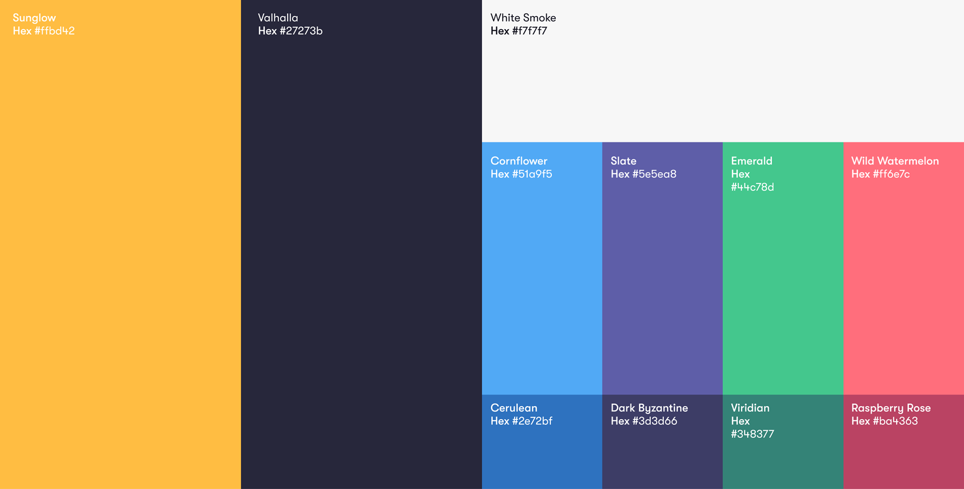
The first and most important thing to address was our color palette. Though functional, the original Fable colors were too dull for the energy Fable wanted to project. I didn’t want to completely overhaul Fable’s identity, but I did want to create a sharper and more deliberate aesthetic.

I began by enhancing our primary colors to infuse vibrancy into the arrangement. Additionally, I expanded the color palette with lively hues complementing our core colors.
Fixing the colors was all well and good, but how did this palette actually translate into content? This is where my background in illustration really came in handy.
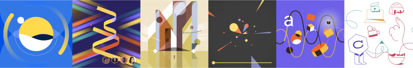
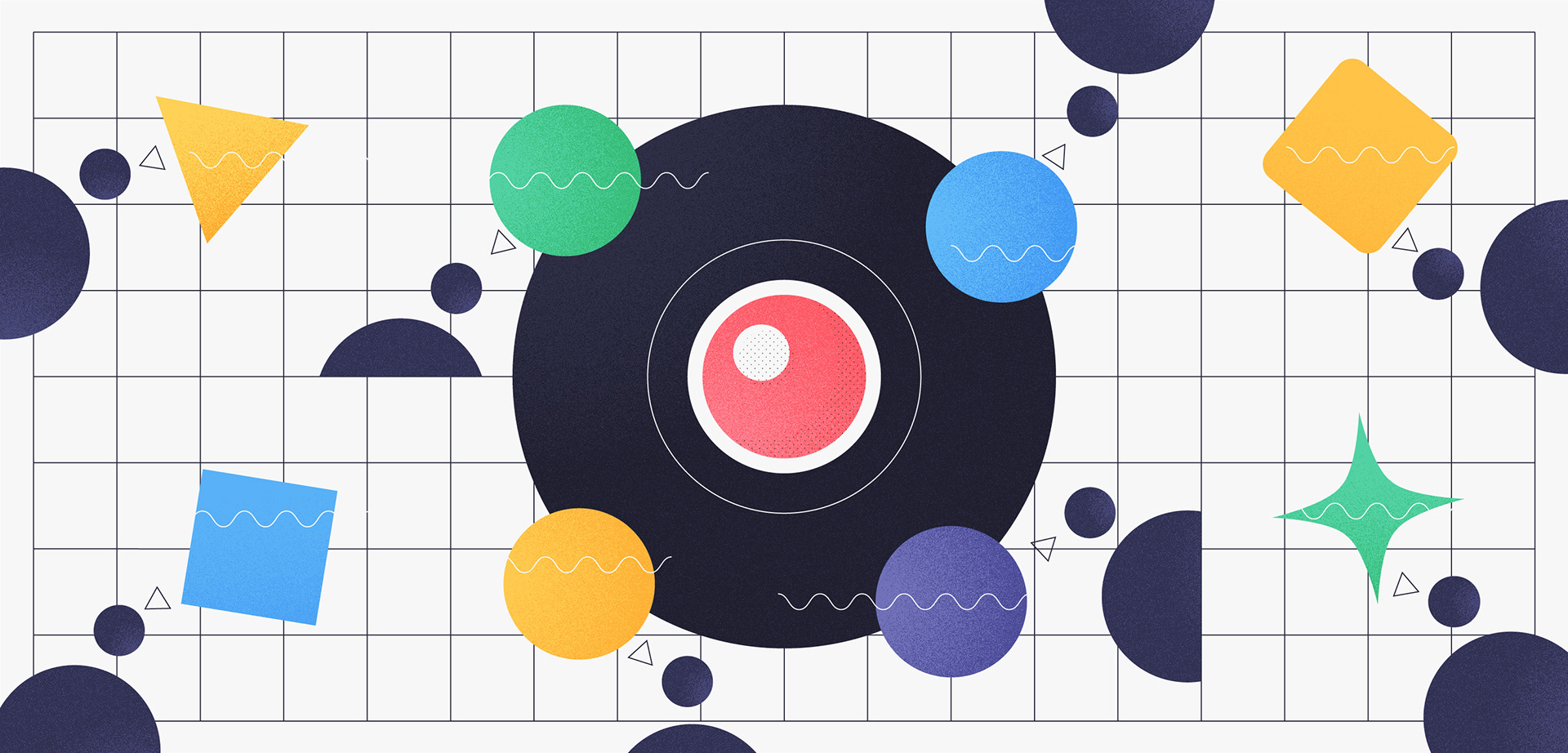
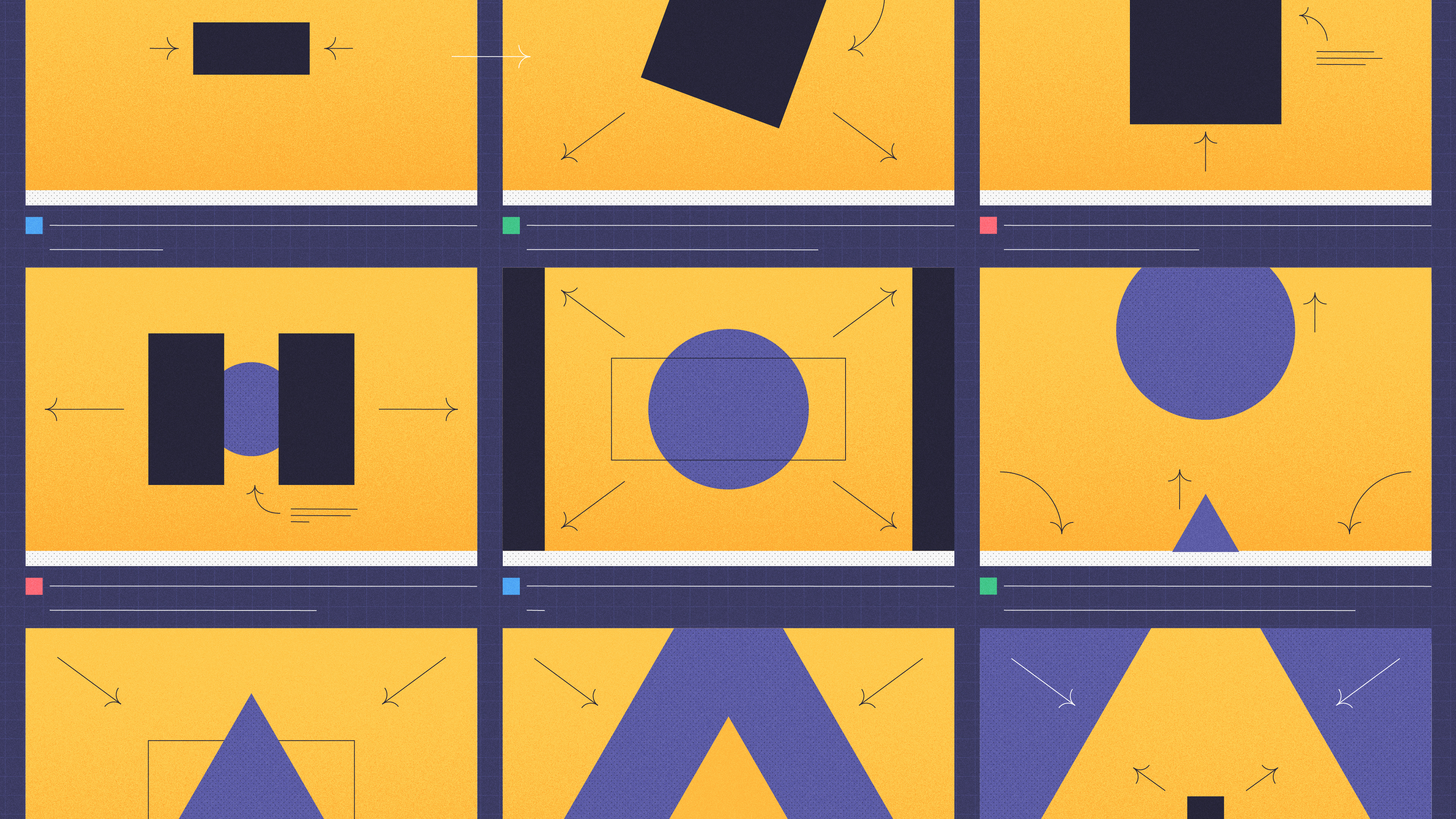
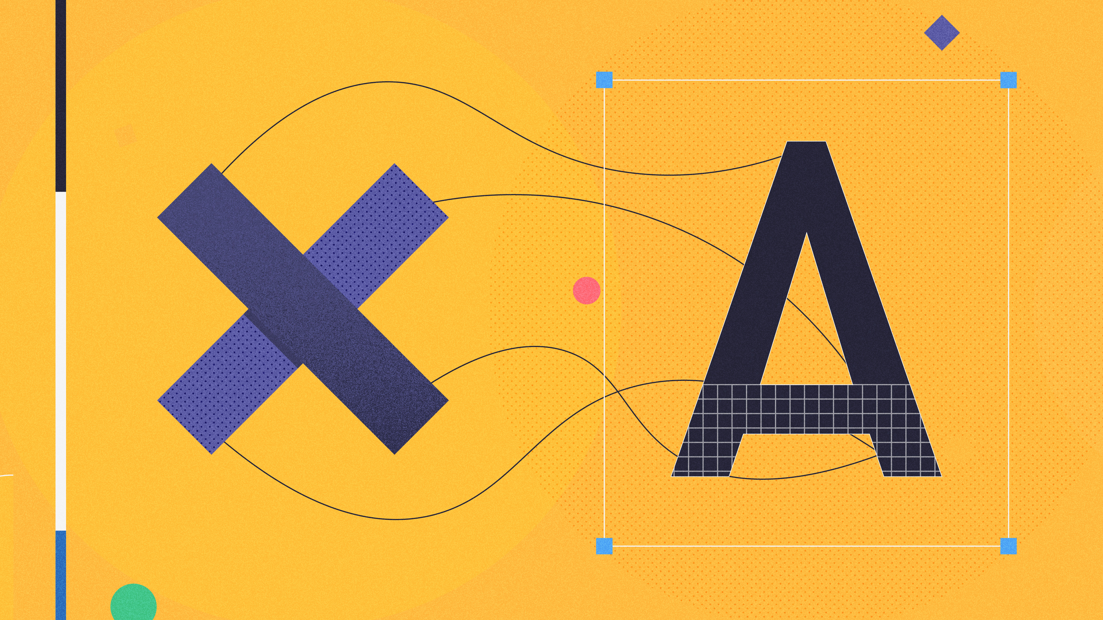
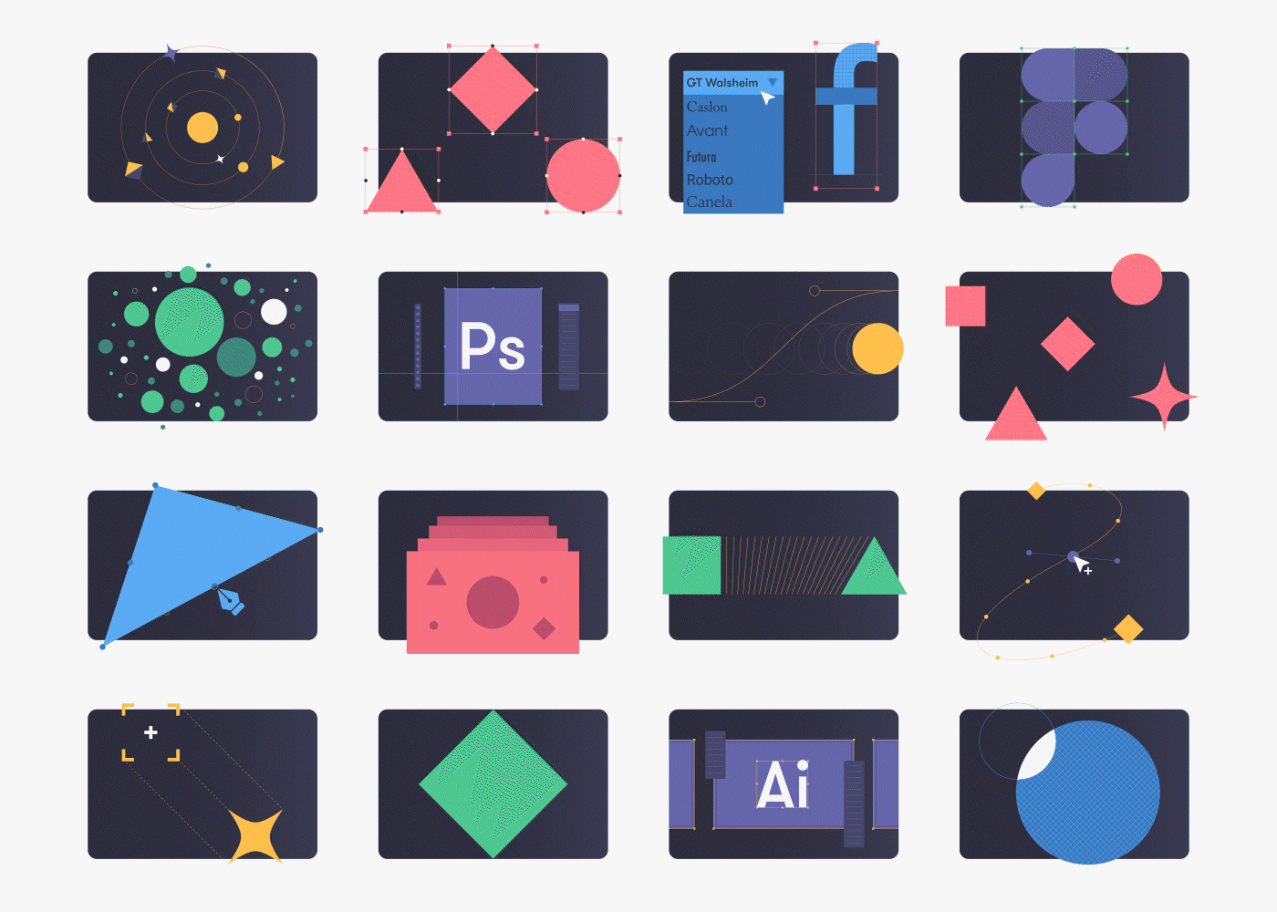
I created a series of illustrations that would help define both the look and feel of our illustrative content, but also help test and refine our color palette further. I wanted Fable to have a clean, bold look, but also retain the geometric qualities of some of the brand’s original artwork. The goal was to keep compositions interesting without resorting to complex shapes or literal representations. Abstract but intentional.
I created a series of illustrations that would help define both the look and feel of our illustrative content, but also help test and refine our color palette further. I wanted Fable to have a clean, bold look, but also retain the geometric qualities of some of the brand’s original artwork. The goal was to keep compositions interesting without resorting to complex shapes or literal representations. Abstract but intentional.


With a significantly stronger brand direction in place, I updated our brand guide to incorporate fresh new color guidelines, such as color proportion and color interaction. Additionally, I refined our typography guidelines, streamlining our font choices to a select few weights for a simpler yet more efficient usage.
All of our branding efforts were put to the test with our next project: redesigning Fable’s website.
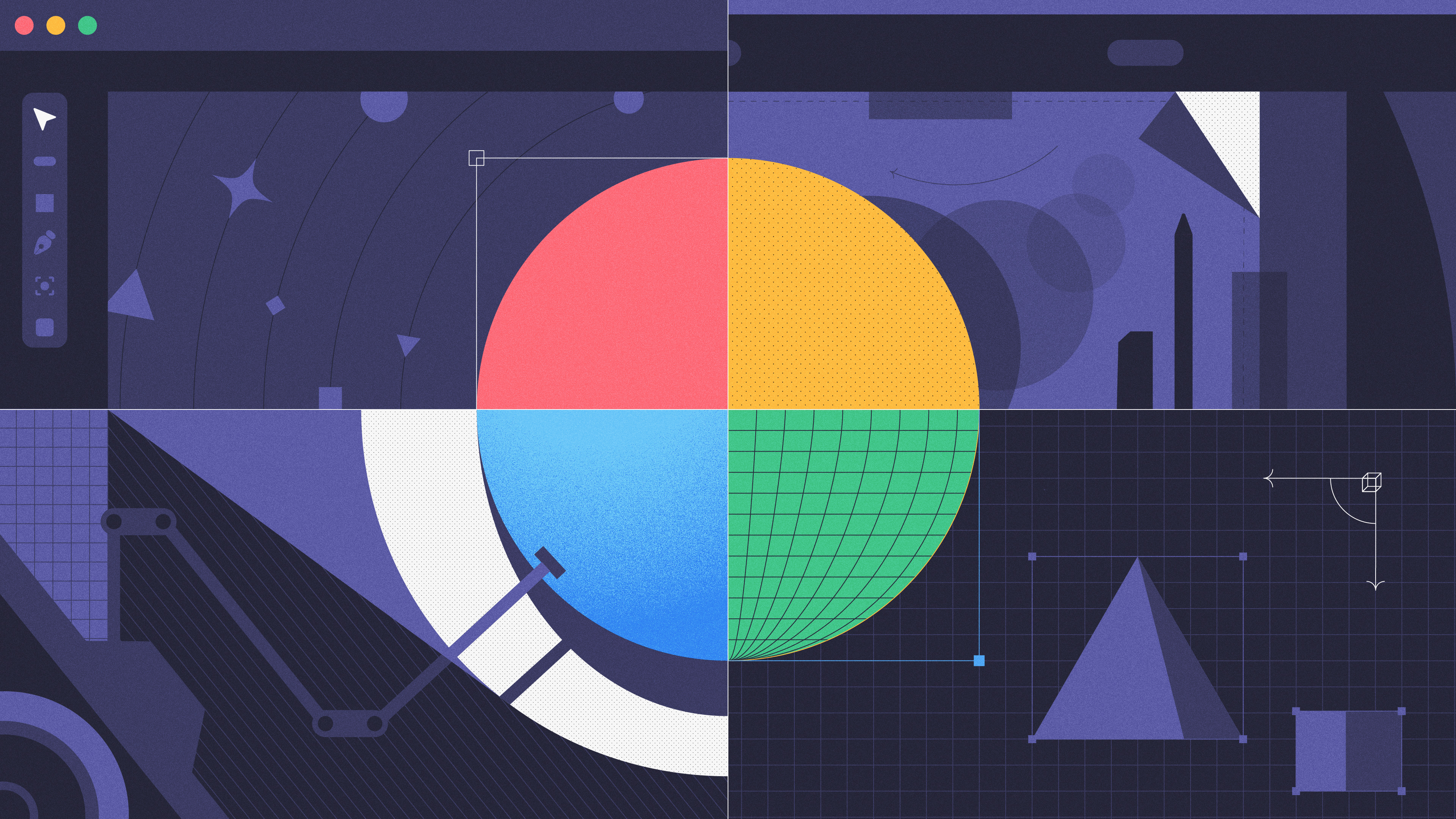
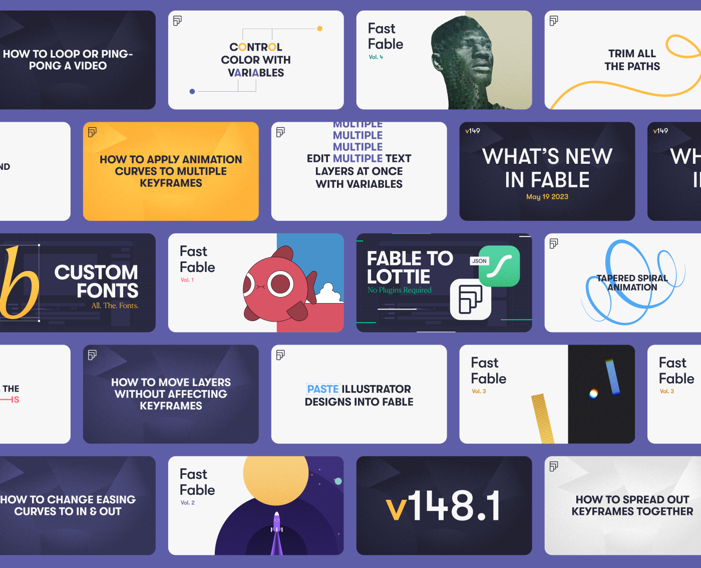
My primary focus was on designing and animating diverse content tailored to each section of the site. At this point our product team was still hard at work developing Fable’s updated UI so in this iteration of the site we wanted to keep things a little more abstract rather than showcasing soon-to-be-outdated UI.
The objective behind these animations was to spotlight some of Fable's capabilities in an engaging and colorful manner, striking a balance between fun and functionality without becoming overly literal.
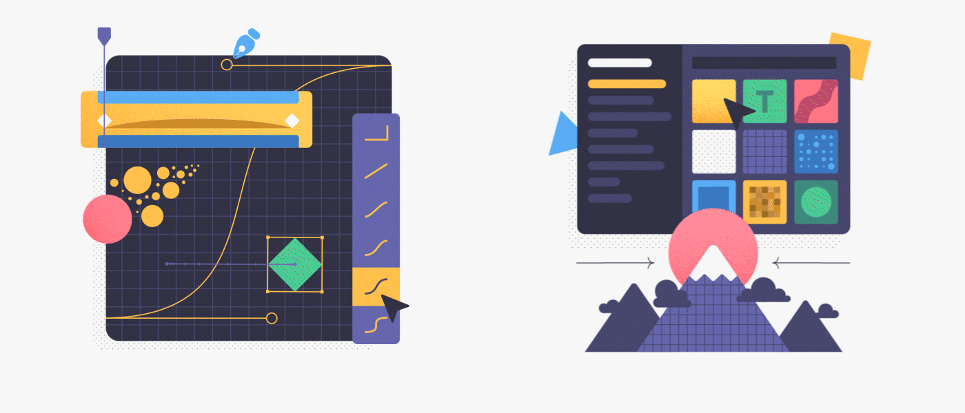


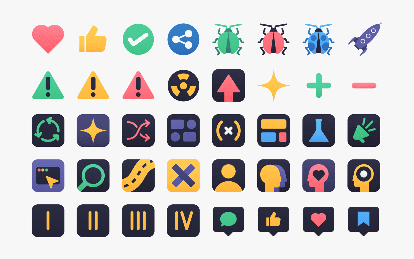
For the features page I crafted small illustrations to represent the various tools and functionalities within Fable. This was a good opportunity to let our secondary palette shine, but also to experiment with our design and ability to showcase complex tools with simple shapes.
The website redesign was a huge success and breathed new life into Fable's digital home. The vibrant colors, clean but bold designs and fun motion revitalized Fable's online identity increasing user engagement and duration of visits.
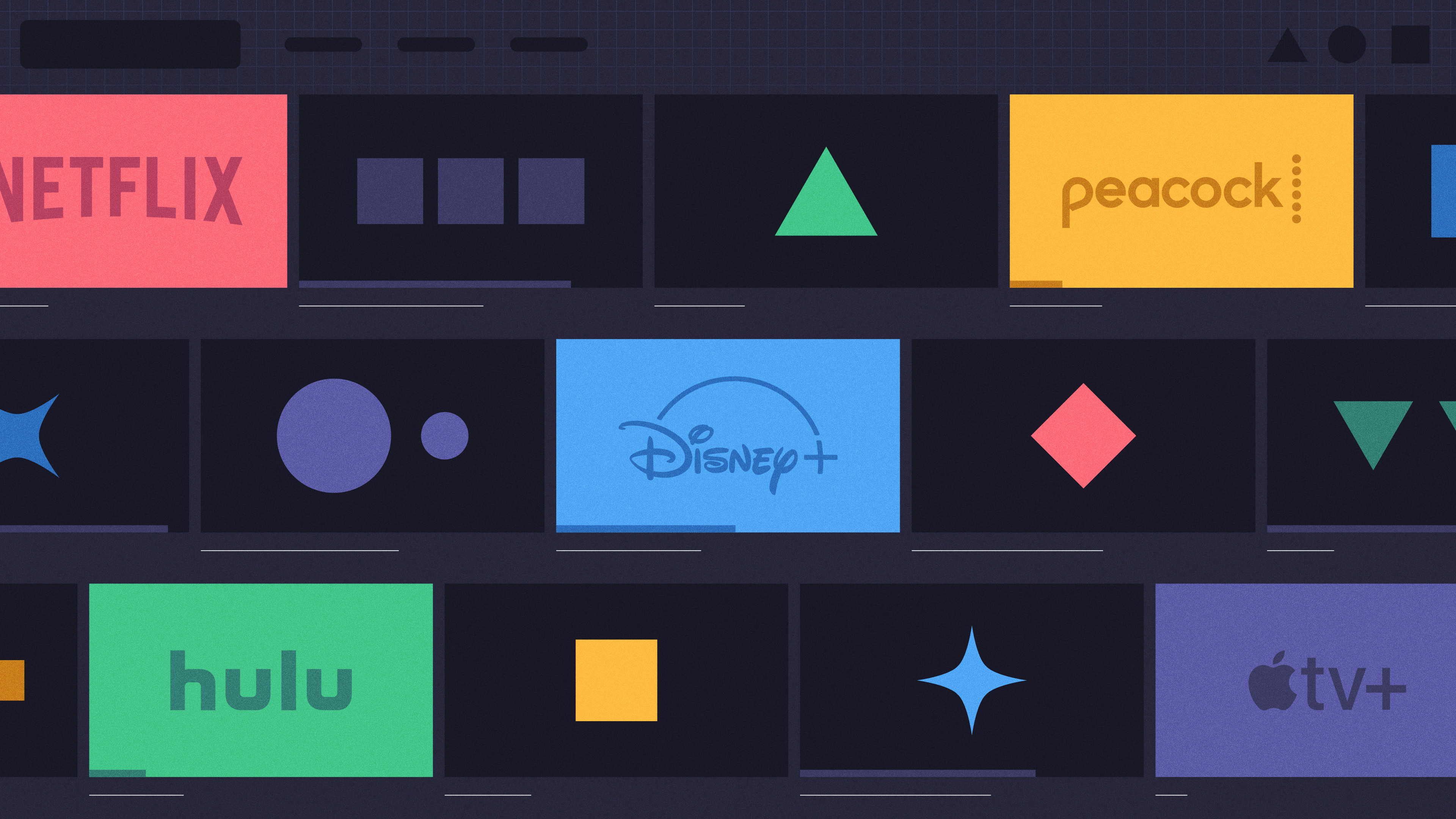
Another recipient of our new branding were our multiple social platforms. New thumbnails were designed to give a fresh new look to our videos and keep a cohesive look and feel across all social media.
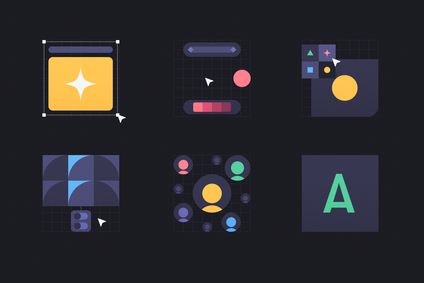
Once it was all said and done I decided to take a bit of a detour and create some branded emojis for our slack channel. Did we need a bunch of new emojis? Probably not, but I thought it would be a nice exercise to create small designs that we could all use as a team.
At this point in time Fable has moved onto a third iteration of it’s website, and even though the design and content philosophy has shifted to a more mature aesthetic, I’m happy to have played a key role in shaping this brand's visual style and direction. I hope you enjoyed this little piece of our journey as much as I did!